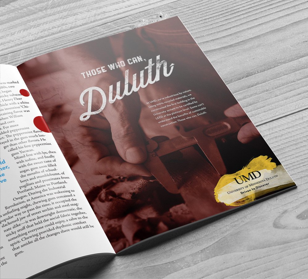
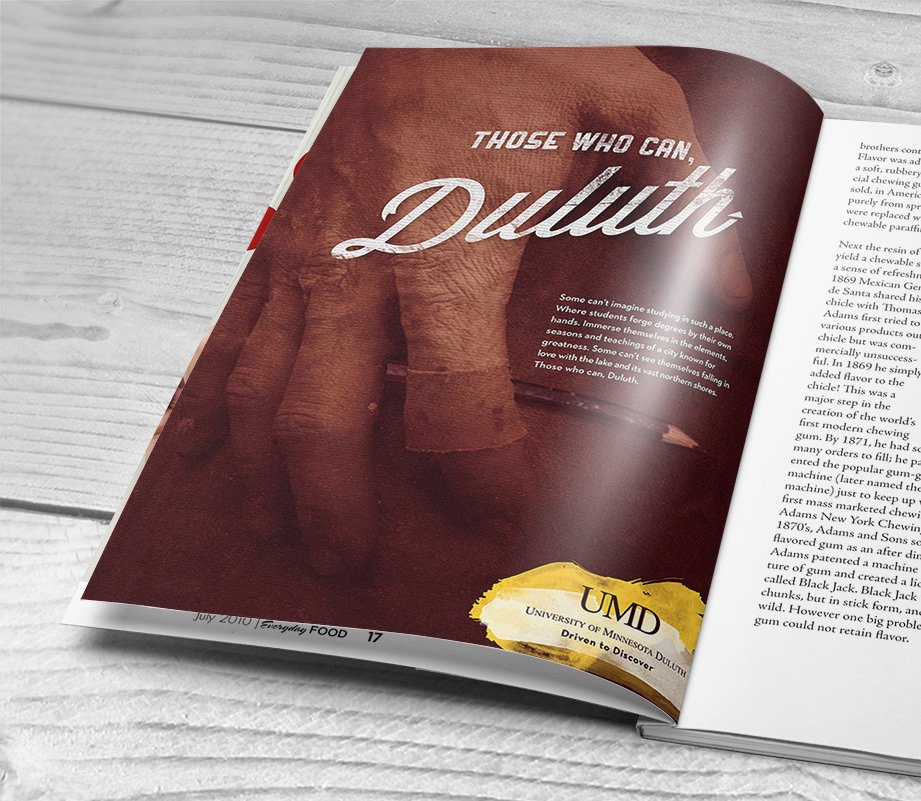
Those Who Can Duluth

THE PROBLEM
Their graduation numbers looked bad.
U of M D had historically just been lumped in with the U of M Twin Cities.
THE PLAN
The numbers only looked bad because students would get a job before they graduated. A good problem. And then they'd come back and finish with a break.
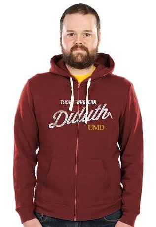
Attract a different type of student than the Twin Cities campus by appealing to the gritty, DIY, up North attitude.
Have the students and faculty literally make their own statement with their own two hands. Gives some ownership, builds a bond and speaks volumes.
THE RESULT
We did what we set out to do.
The City asked us to do a tourism campaign for them.
People made some cool stuff.
Role: Art Director, Designer
Creative Director: Matt Burgess • Writer: Kris Growcott • Agency: OLSON

On the first day of school, students were welcomed to pull their own screen to print a poster or a shirt.

Thick canvas flags embroidered right on campus.

The idea here was to create a billboard with the metal class and let it patina outside. They ended up doing it with the wood class instead.


One of the goals of the campaign was to unite the faculty and students. A tall order. These embroidered flags tout impressive career feats in a casual tone to both inspire conversation and respect.


Murals painted with poor quality paint, to fade and crack in the rugged environement to add a little extra character.